

Over the years, I've had the incredible opportunity to work on a number of amazing projects. One of those incredible opportunities was working with Wizards of the Coast on a series of cards for Magic The Gathering.
Working with Wizards of the Coast opened my eyes to how much care and attention their team pours into every single card - and it's quite a bit of work! The art directors send detailed world guides as well as ample visual resources which all add up to the most thorough brief an illustrator can ask for. This gives everyone the best chance of creating imaginative and magical illustrations and I count myself extremely blessed to be able to participate.
Now, let's dive in!
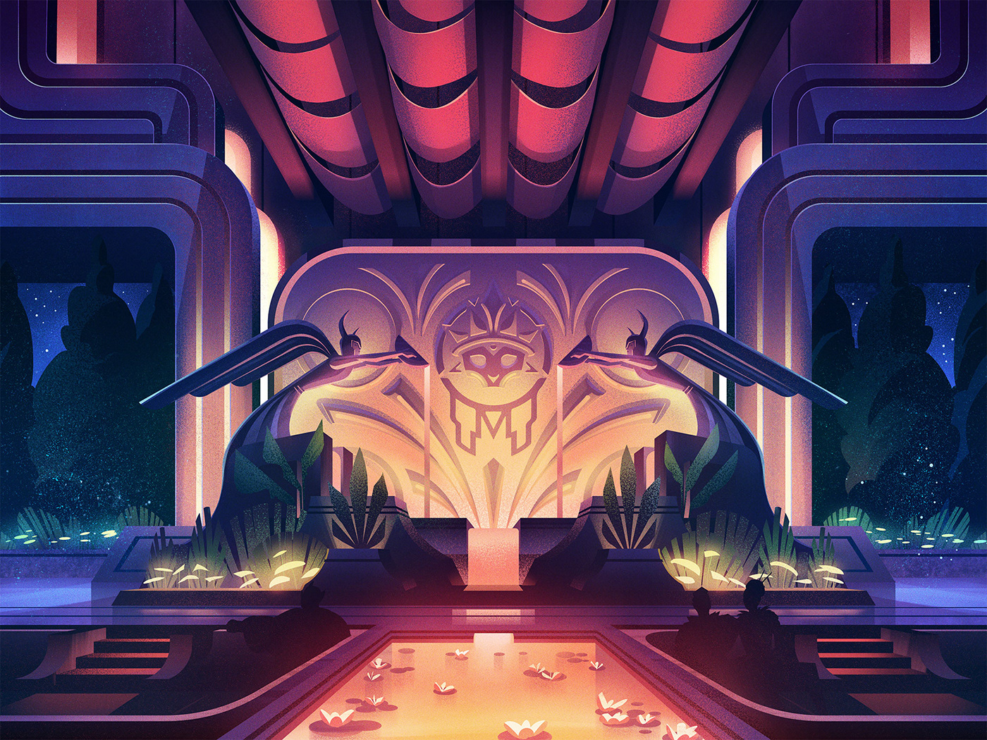
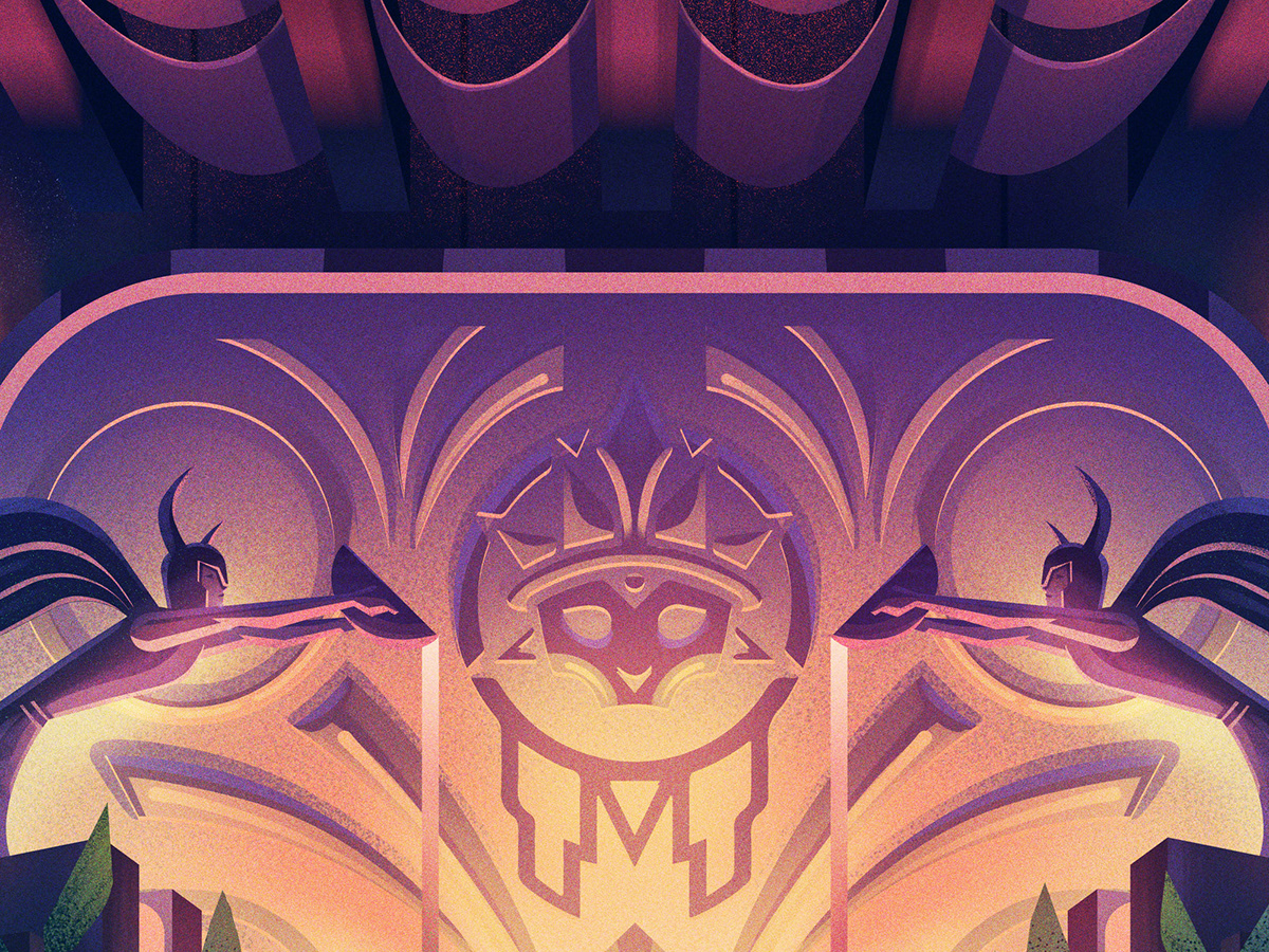
Cabaretti Hideout
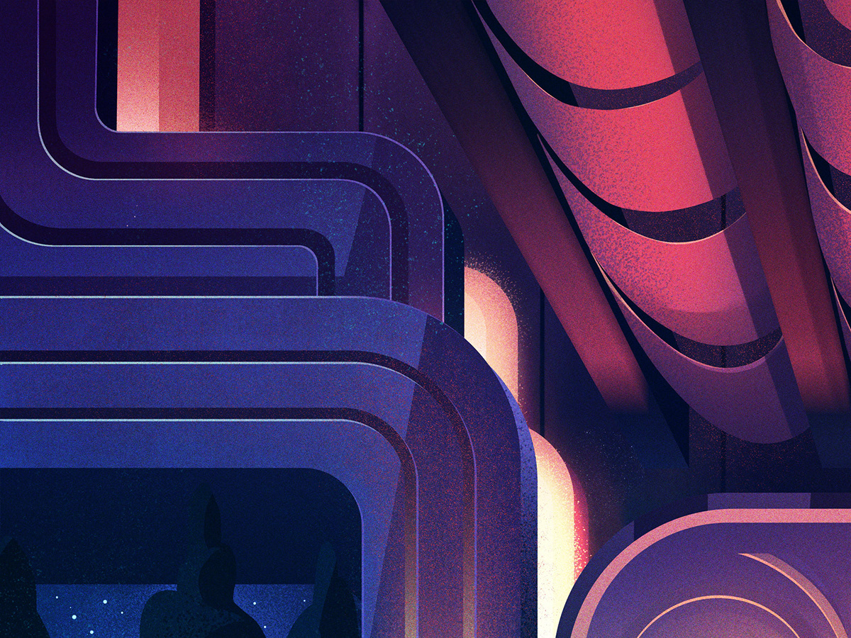
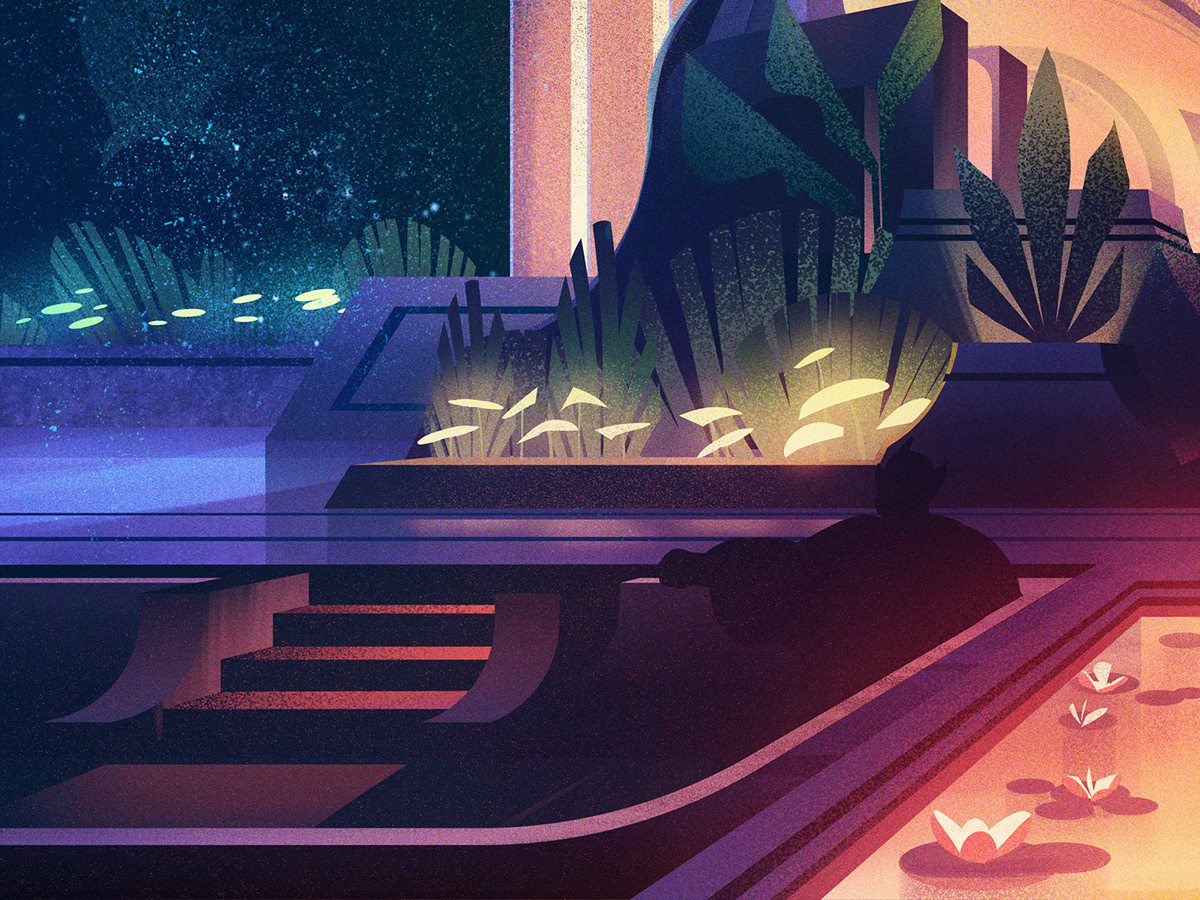
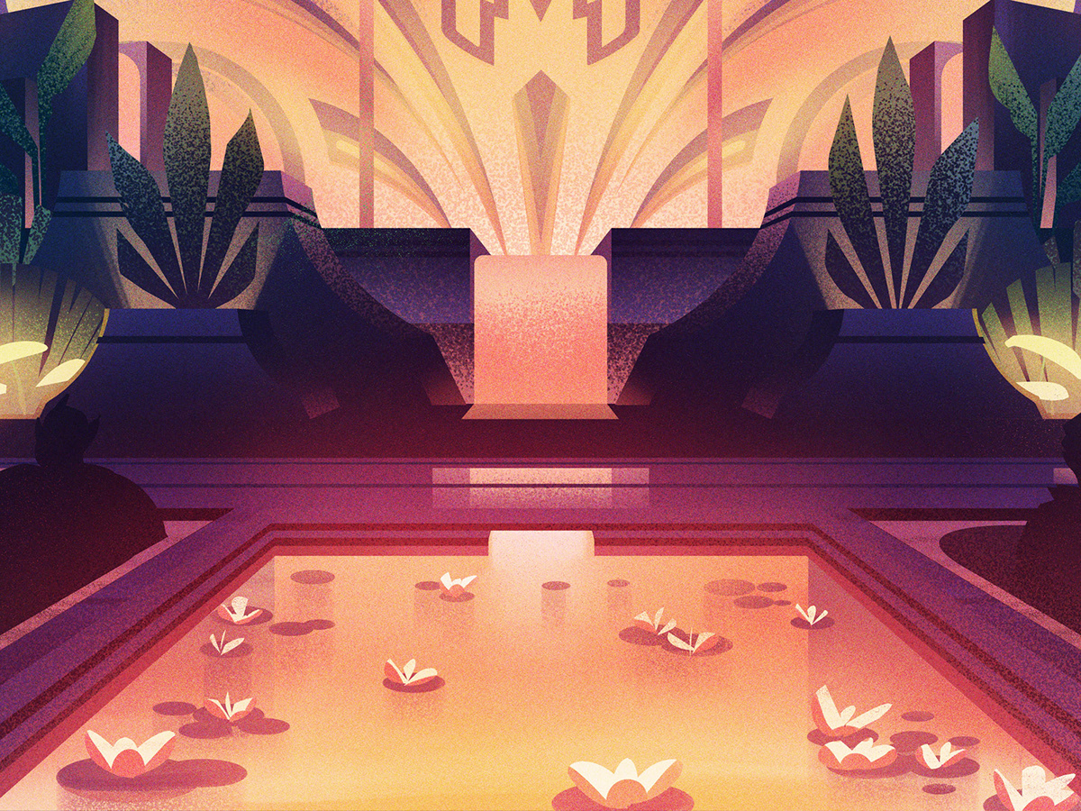
One of the first pieces I had the fortune of working on was the Cabaretti Hideout. This was a secluded setting for the elite where deals were made in the shadows. I wanted to create an ornate fountain which would draw attention away from the seating areas where patrons could relax free from prying eyes.
Sketches
I did a bunch of sketches for this interior and in the end, this was the one we went with. The symmetry made for an interesting composition which helped direct the eye to the prominent features of the piece while allowing room for a bit of discovery as you looked closer at the illustration.

Once the final sketch was chosen, I did a handful of rough color studies and then it was time to paint. I focused on crafting strong shapes for each of the background components, each which served to direct the eye further into the composition. I also added lots of atmospheric details which, while you may not be able to see fully in the printed card, you can still feel.


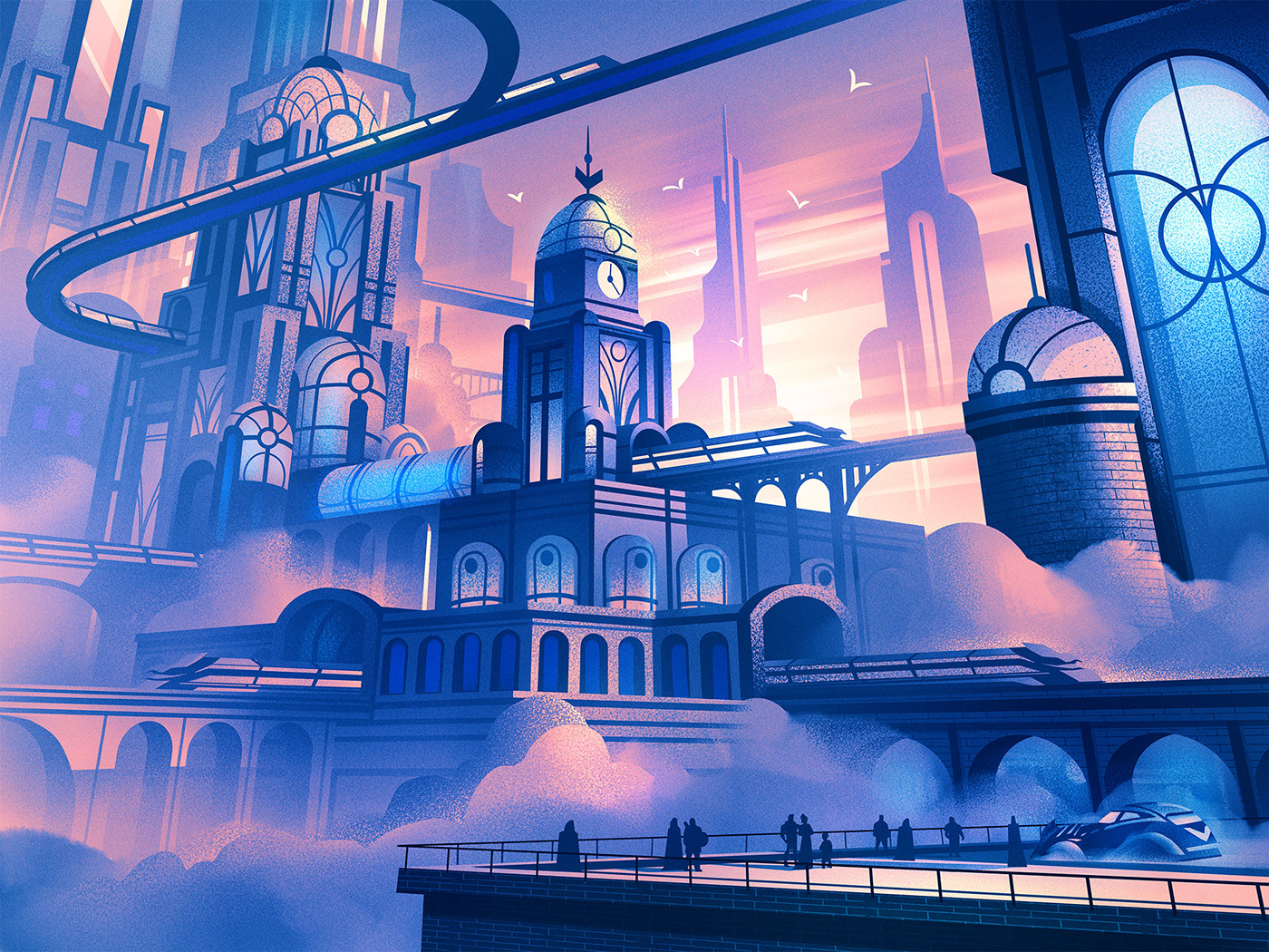
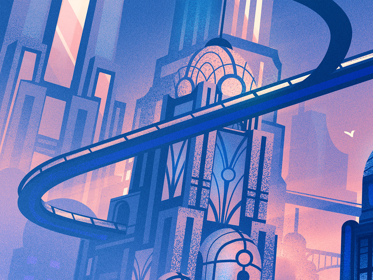
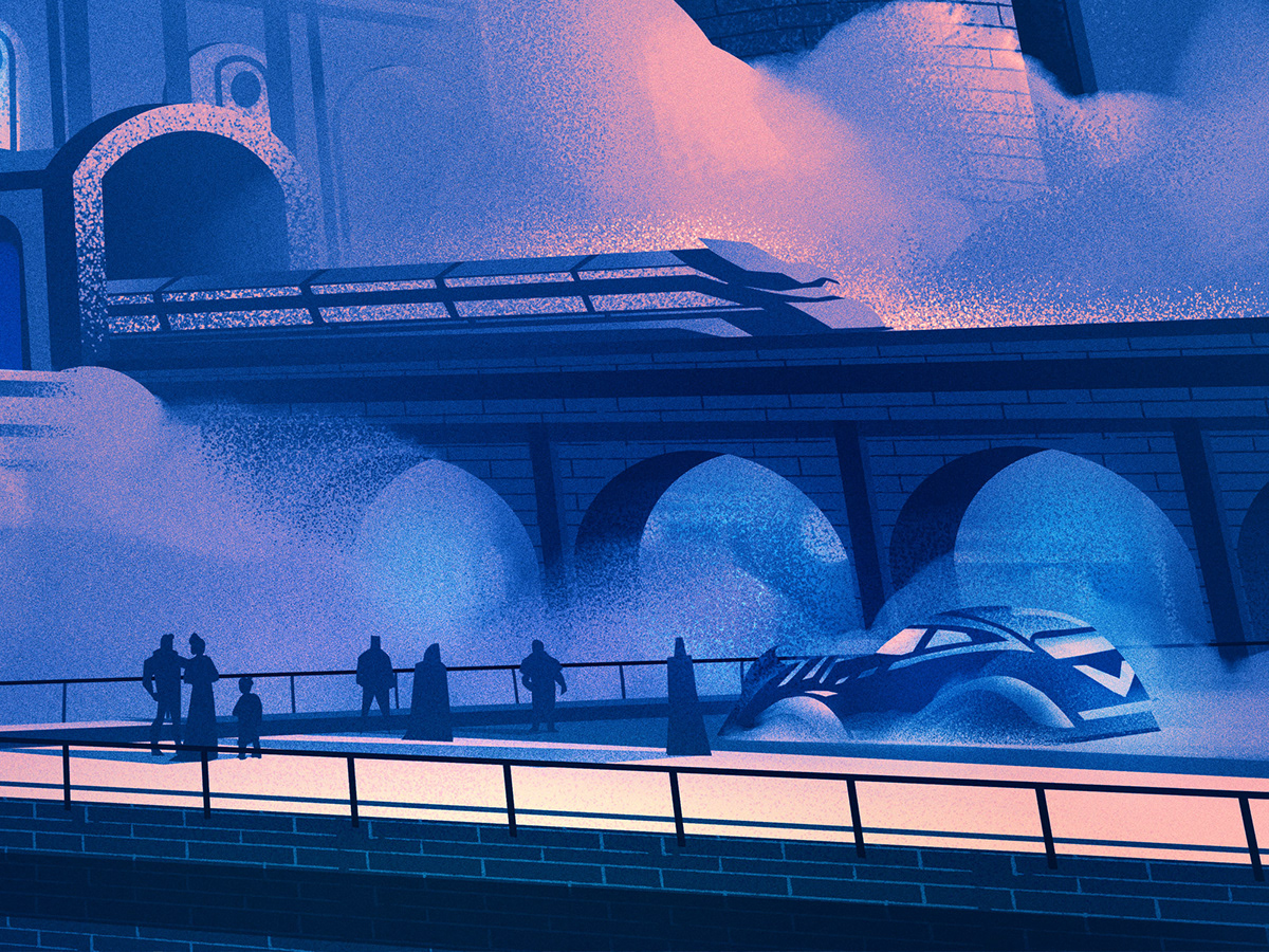
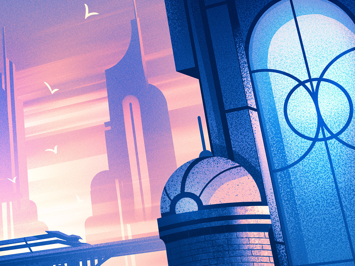
Transport Hub
The Transport Hub was definitely one of my favorite pieces to work on. It was to be a place within the towering city where magical trains departed. I pictured the station being one of great heights that rested in the clouds as trains moved through glass tunnels and sky bound railways.
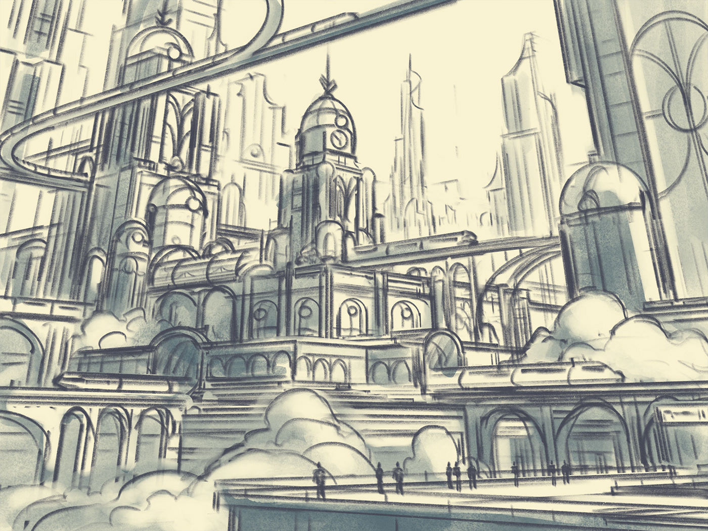
Sketches
Once again, I did a bunch of sketches for this one to try to find a composition and design I was happy with. For all my sketches I worked in Procreate and limited myself to a single graphite brush which allowed me to focus on the composition, architecture, and structure of the illustration.
With the sketch in place, it was time to work on the details. The style of these cards was a mix of fantasy and art nouveau - two things I love. I made sure to add lots of details to reinforce the theme as well as textures to help add atmosphere and depth into the piece.


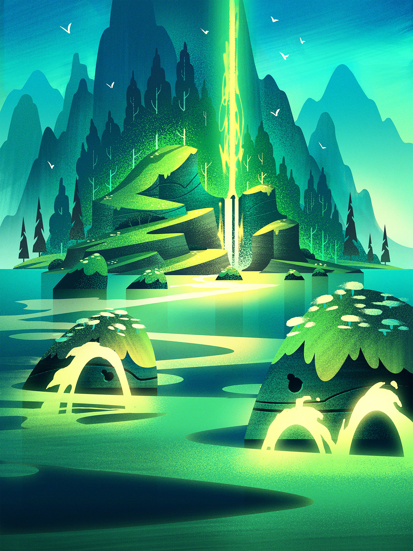
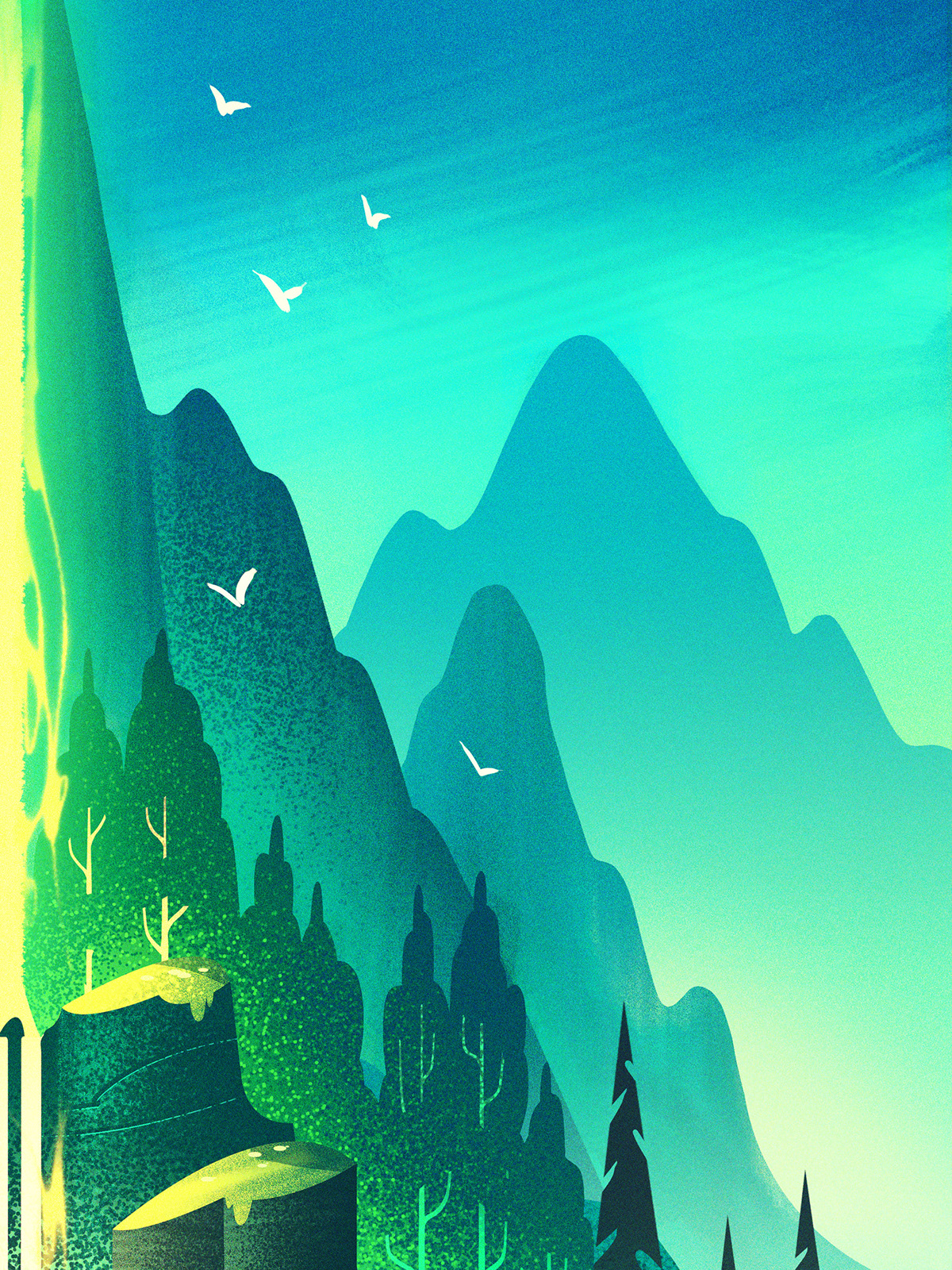
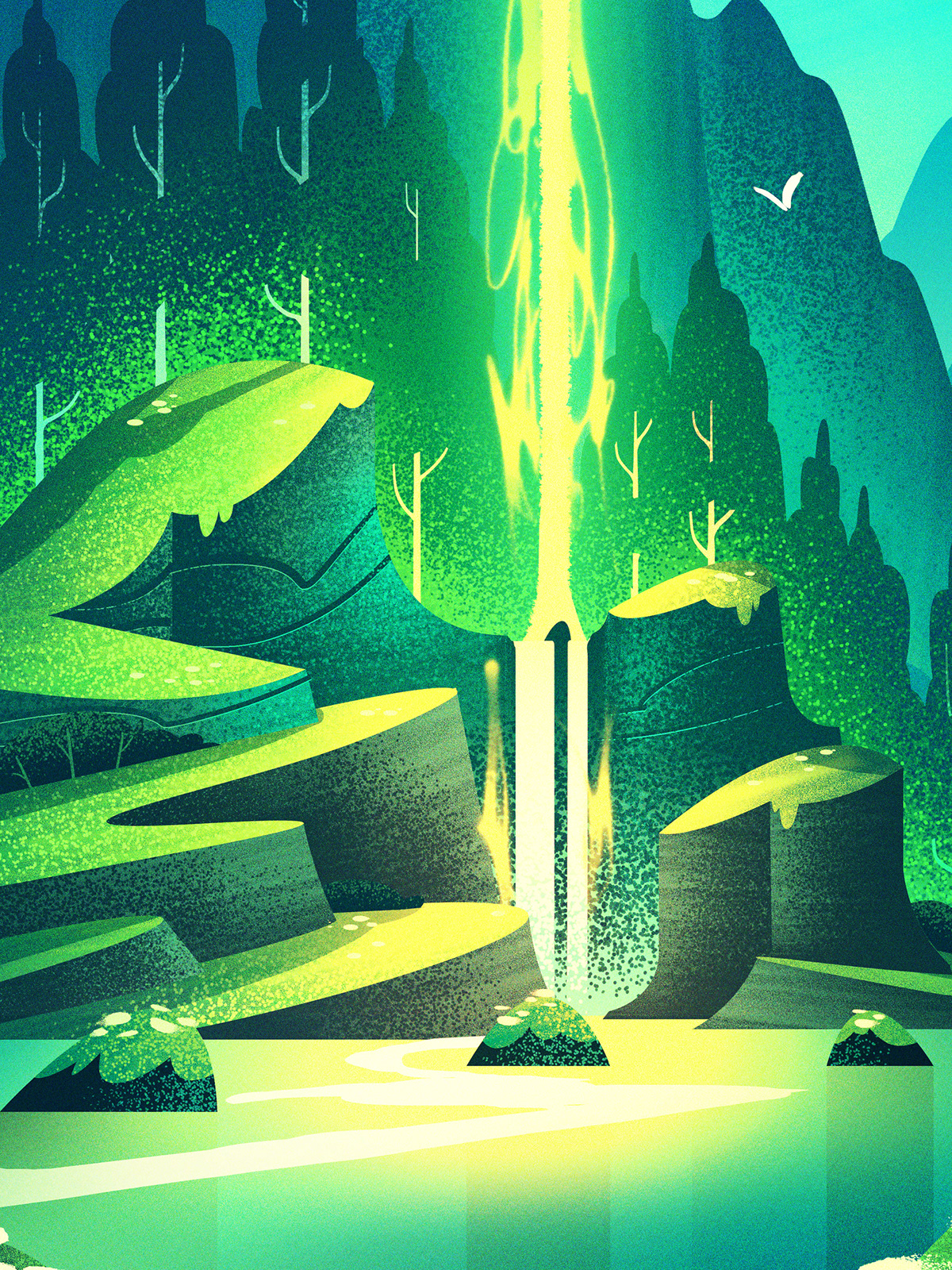
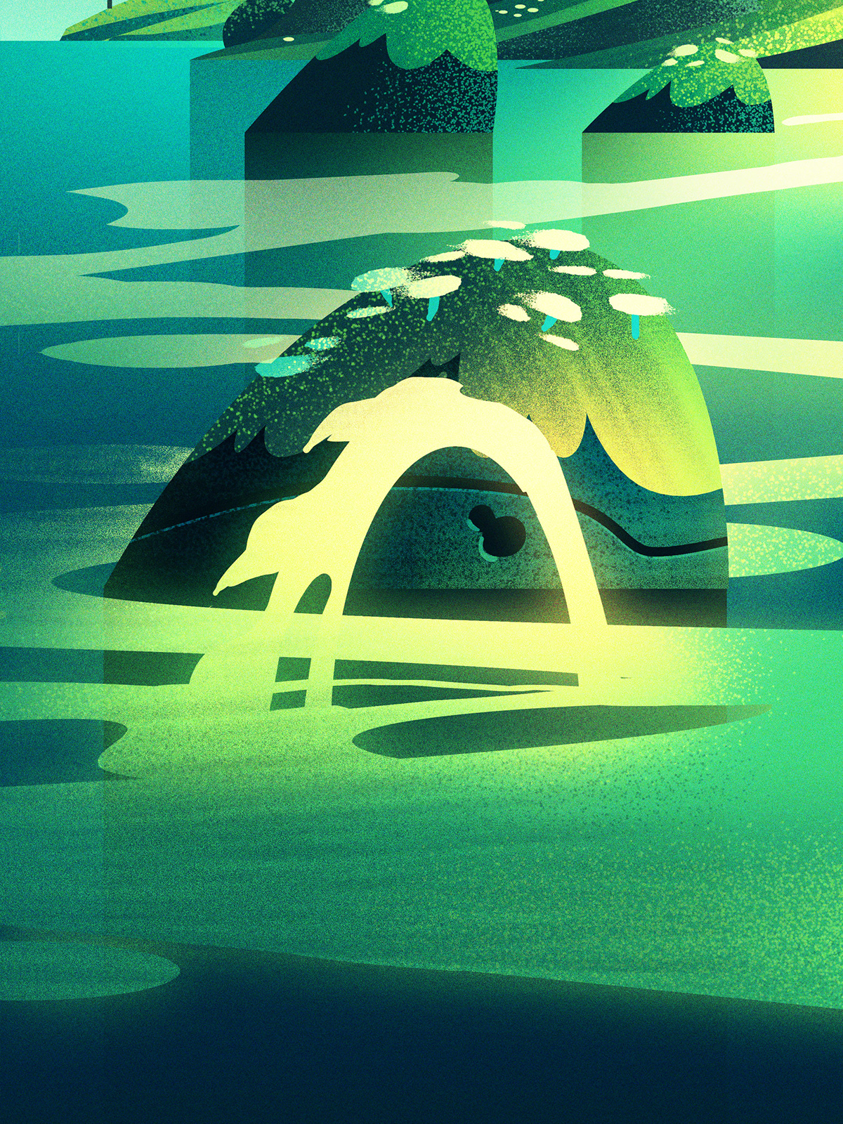
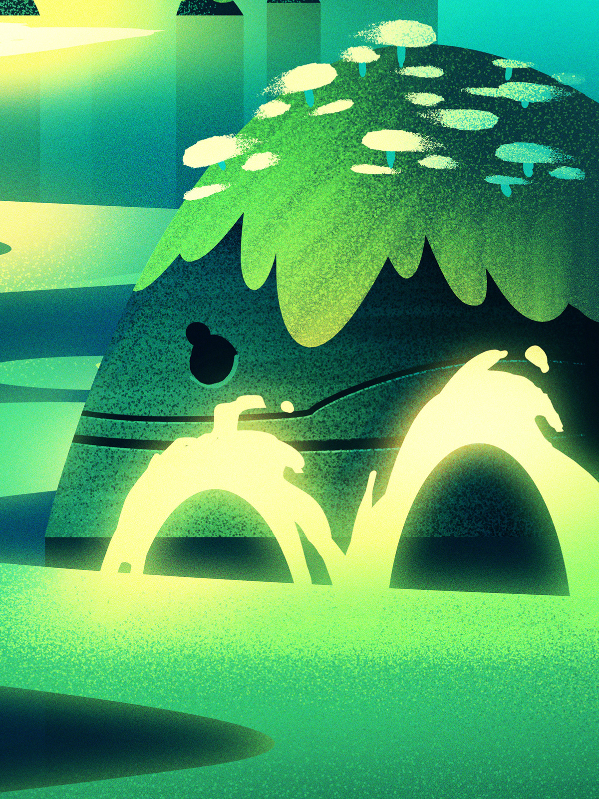
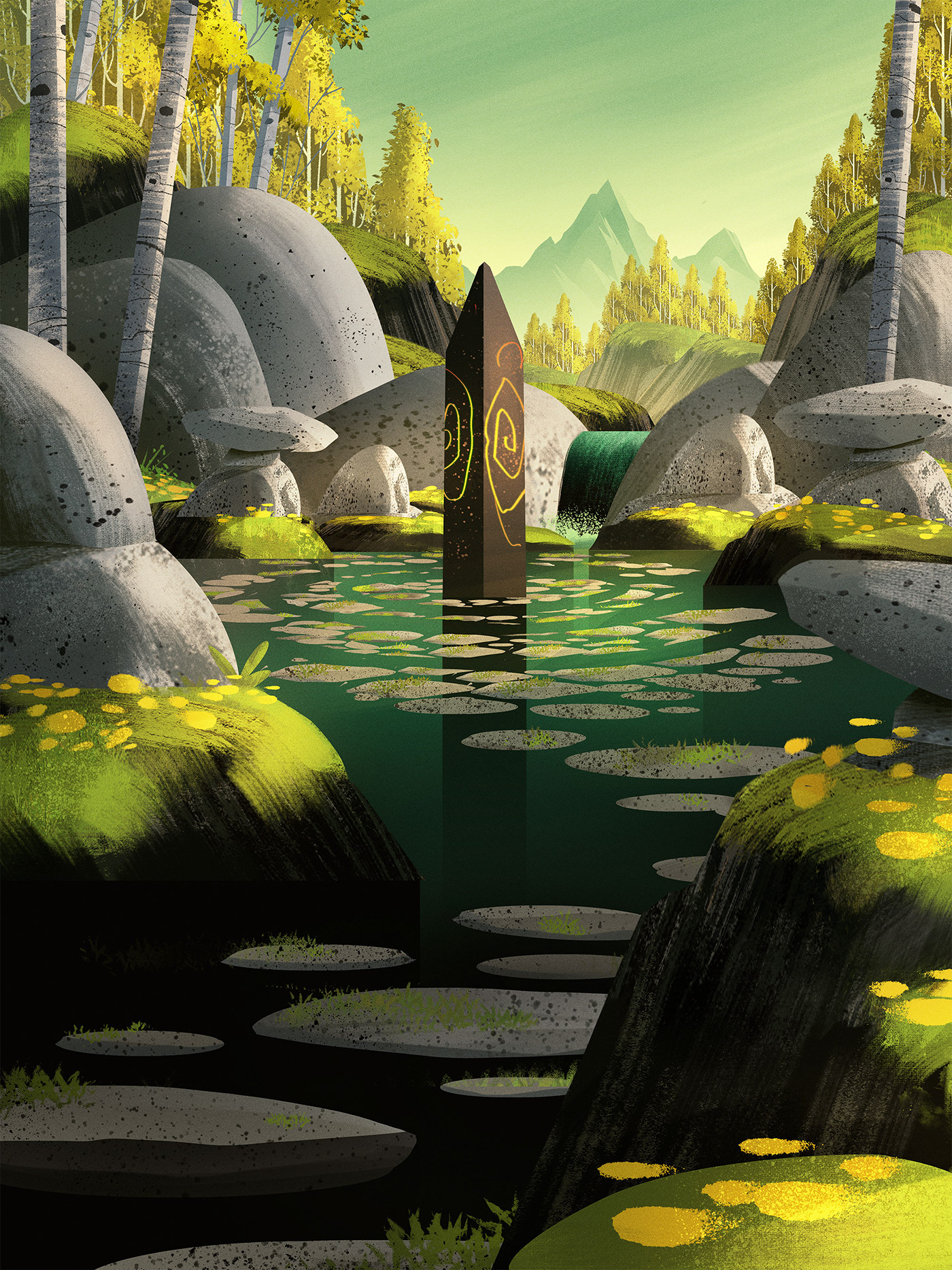
Leyline of Abundance
The Leyline of Abundance card was one of my favorites to work on. I was tasked with creating an enchanted landscape where energy courses and surges through the hills & trees.
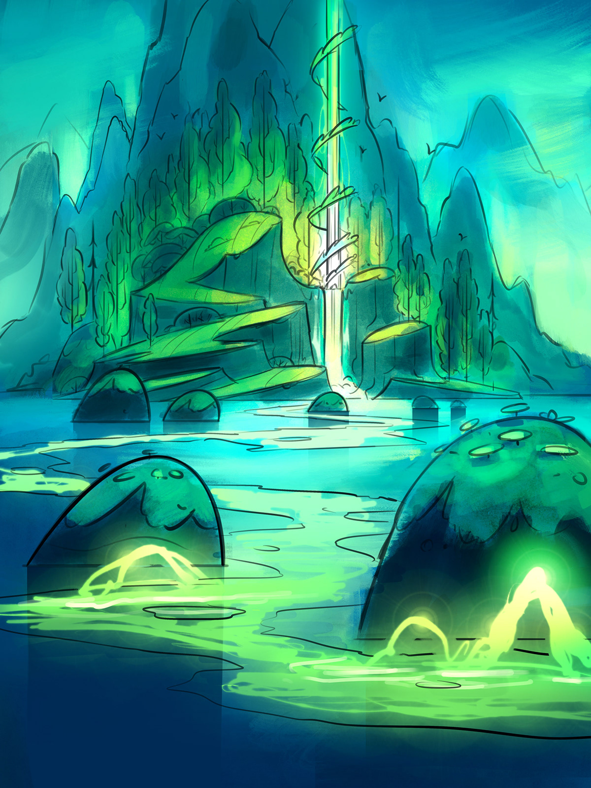
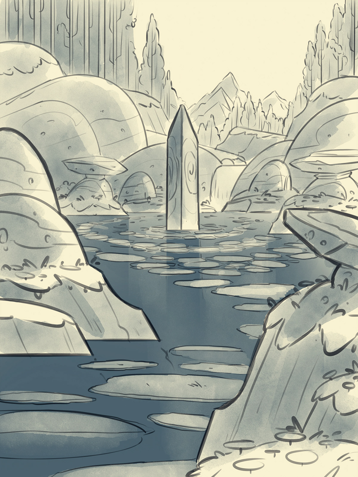
Sketches
For this piece, I opted to work in a bit of color early on because I knew it would be key in creating a dramatic effect. I designed the chunks of land to all swoop and curve in a way that would highlight the magic in the card.
Once the sketch and color roughs were approved, I moved onto painting. Creating the shapes for the elements in this piece was a lot of fun. You can see a lot of the textures up close - lots of stipple effects using custom stipple brushes that add a nice look and feel when the card is printed at a smaller scale.

Intangible Virtue
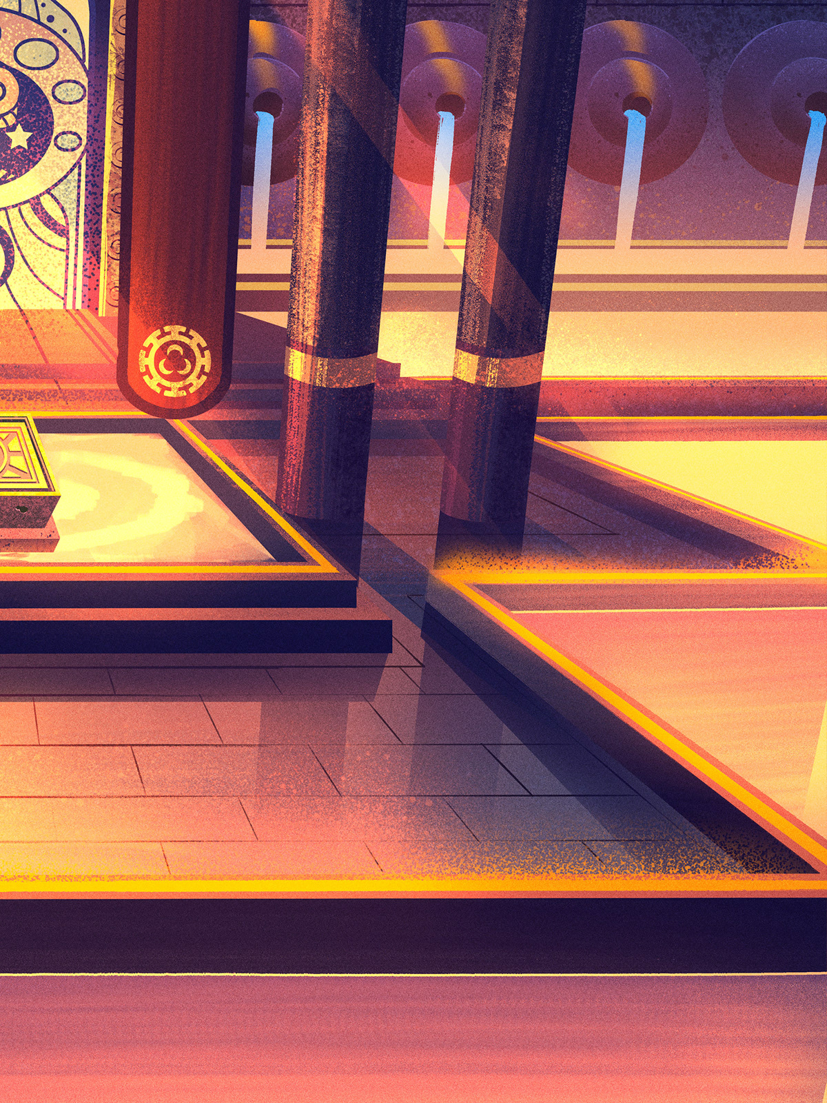
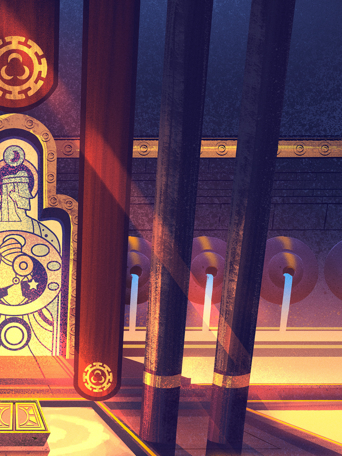
The Intangible Virtue card was quite challenging. We needed to see a tomb that told a story and didn't look cryptic or dark. I thought it could be interesting to use a stained glass feature to hint at the story of those who occupy the tomb - and to create towering architecture and water works which served as an elaborate memorial to those buried within.
Sketches
The height of the card was designed around the card layout itself. I had areas of purposeful negative space at the bottom which would serve as the backdrop for the text that would be added to the card illustration once I was done. The center of the card would house all the detail while the outer edges of the piece would have framing elements added later by the Wizards of the Coast designers.
Once we landed on the right look and feel with the sketch, it was time for those glorious details.

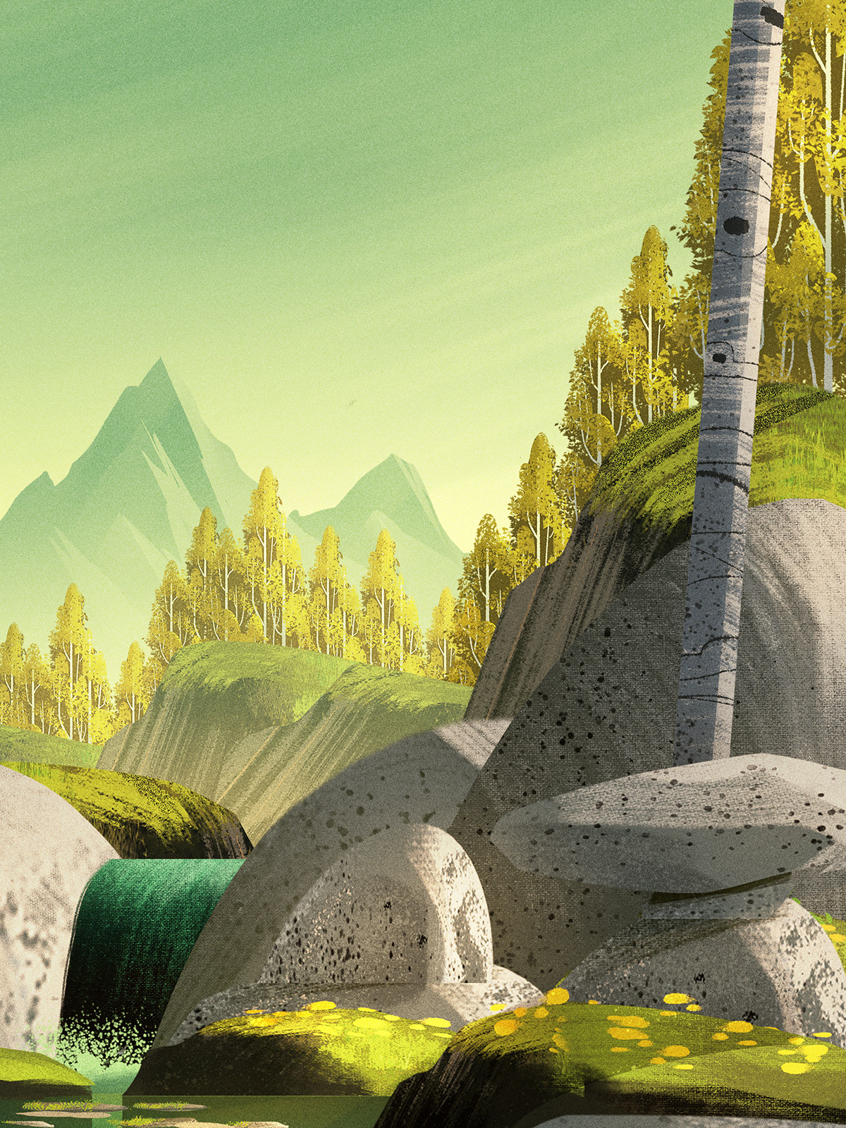
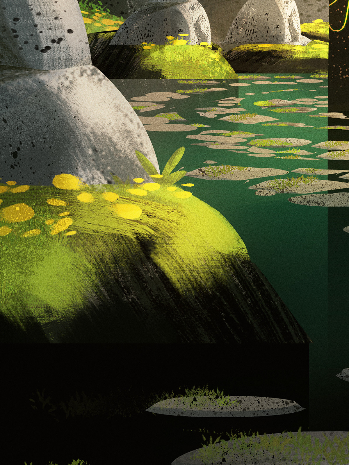
Ground Seal
Now we reach one of my favorite pieces: the ground seal! This piece was one of my favorites because I really let loose with the shapes of all the rocks, hills, trees, and mountains. Up close, the textures are quite brushy and loose - but when you zoom out or print this smaller, all those textures end up singing.
Sketches
For the sketch on this piece, I actually ended up working a bit backwards. I started with color shape designs painting quite quickly, moving things to change the composition, and really thrashing around on the canvas. Once I had everything where I wanted it, I reworked the piece using lineart to see where things landed.
Once the sketches were approved, I moved onto painting. I really tried to define my shapes quickly and worked loosely with the brush strokes. Then I tightened things up with subtle lighting and shadows to create the end result you see here. What I love about this approach is it allows me to work quickly, expressively, and towards an end result which looks quite nice once it is shrunk down and printed at the smaller scale of the cards.


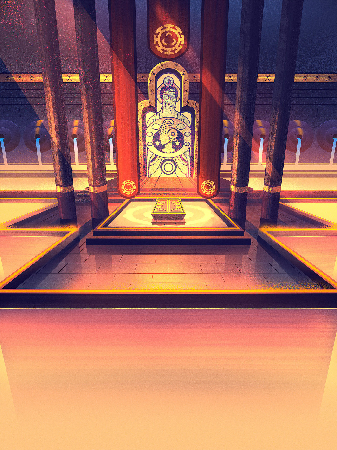
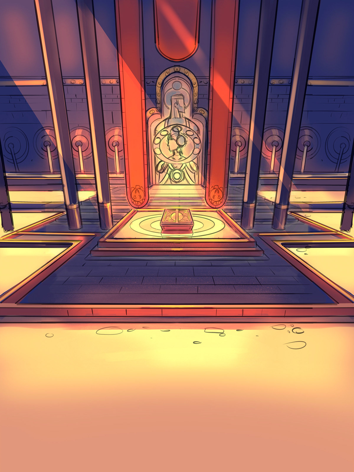
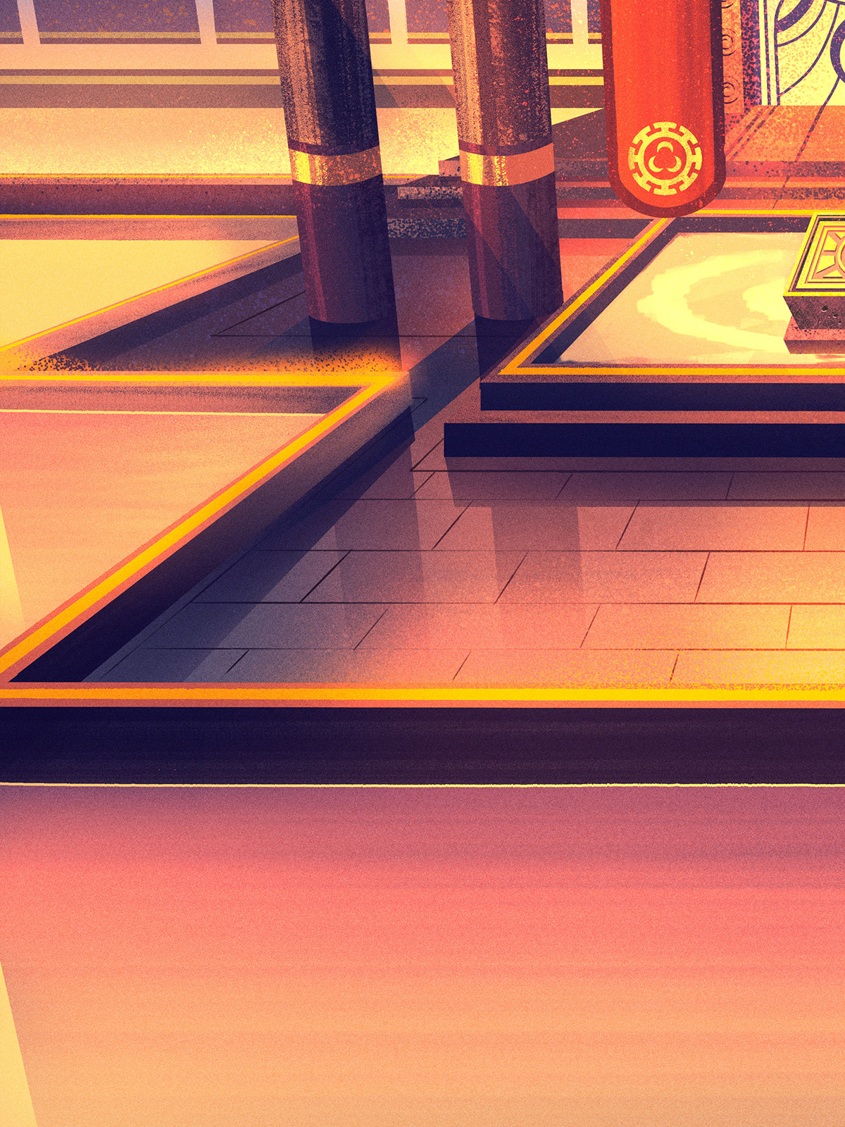
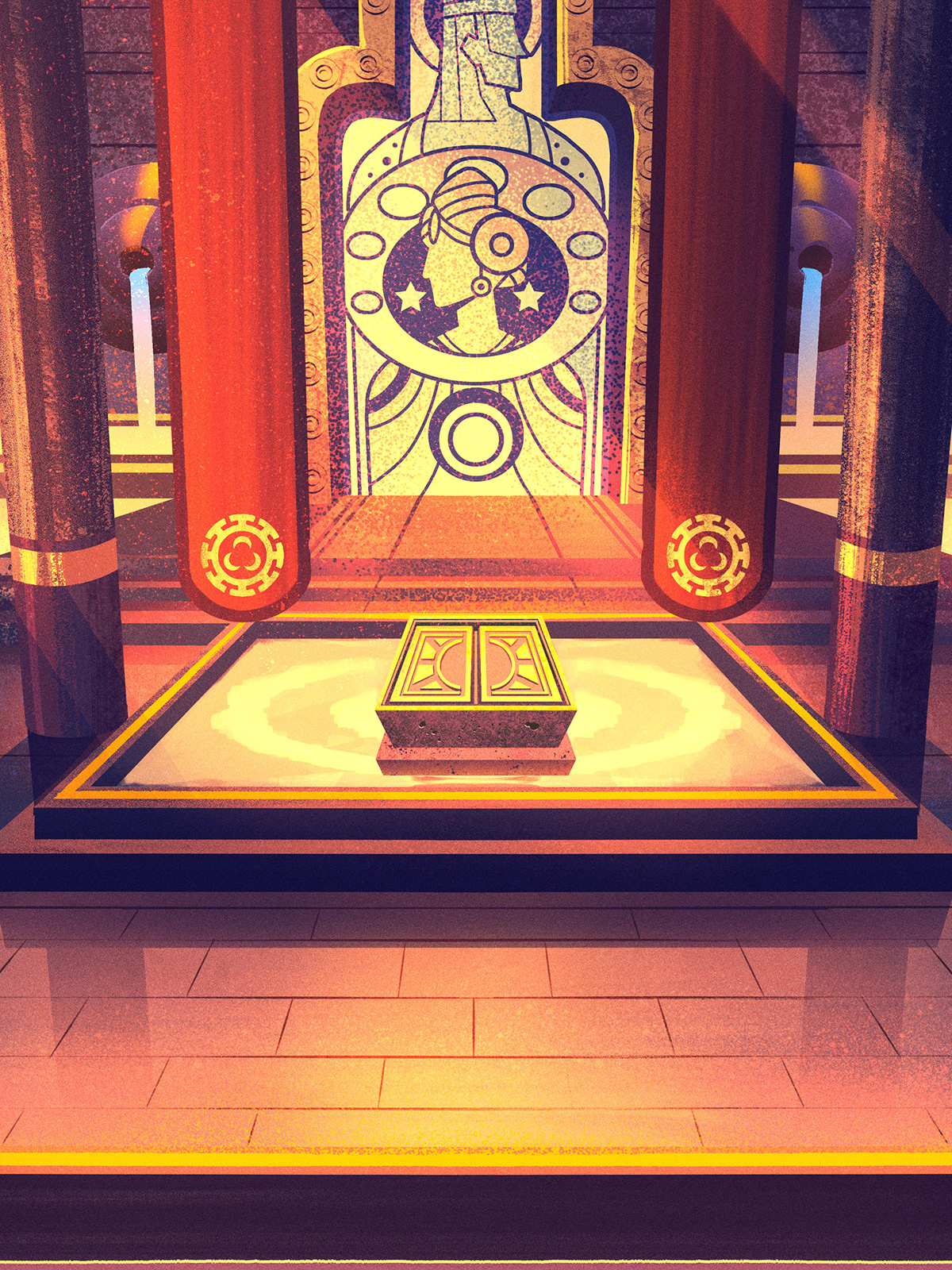
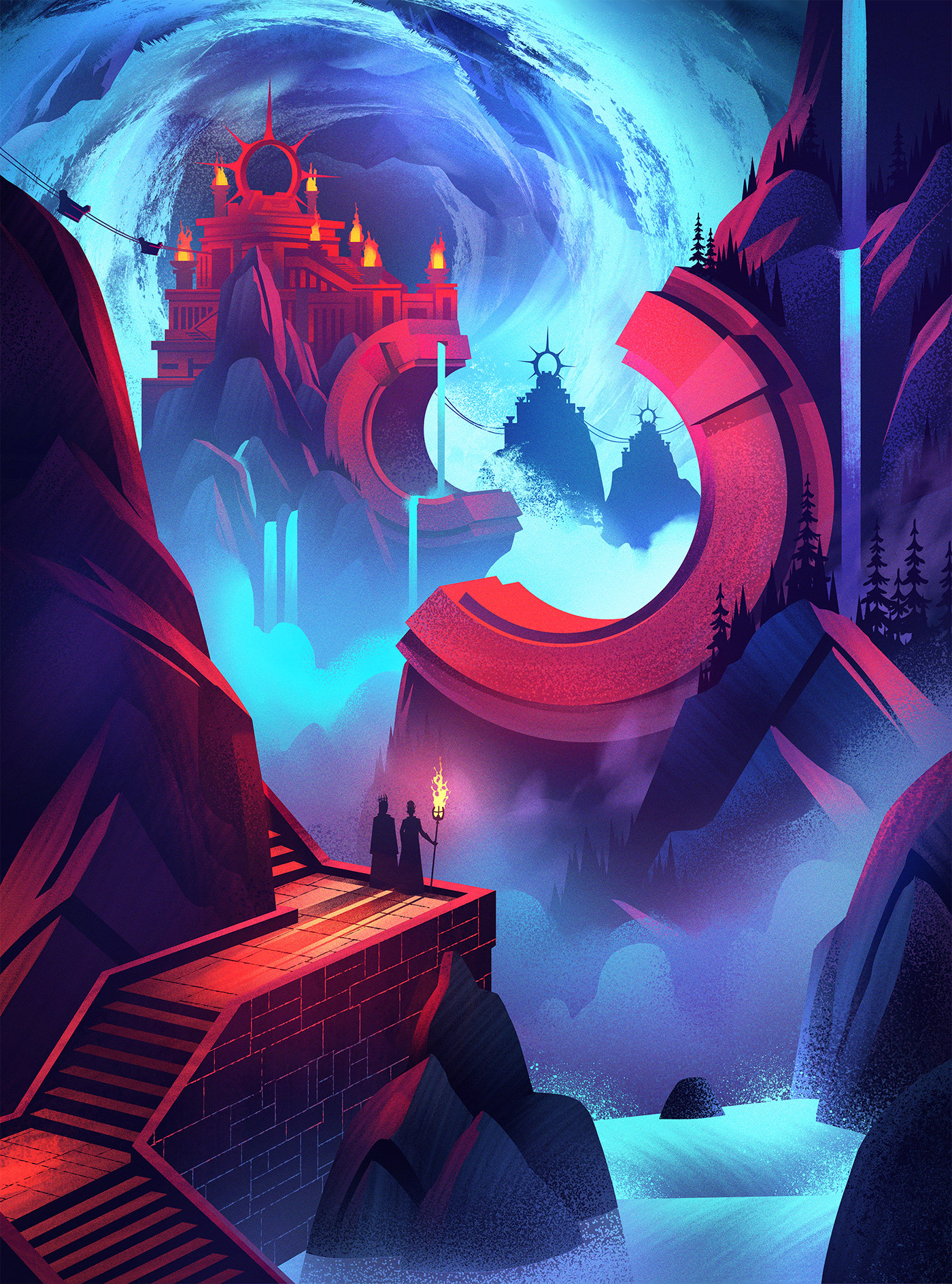
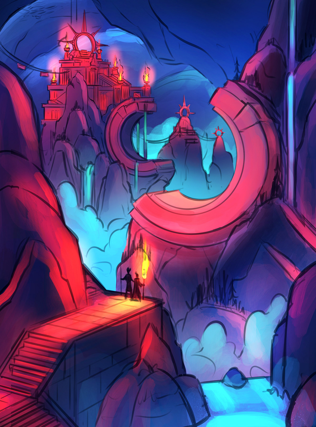
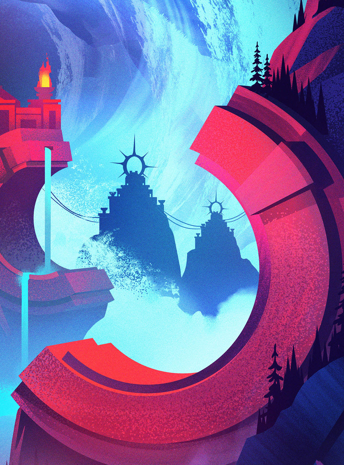
Mountain
The last piece in this series was a mountain temple built underground. The architecture and styling were both tightly defined by the world guide and a lot of fun to work with.
Sketches
Sketching this one was a lot of fun as well. Once the design was approved, I did a handful of different color designs - from bright daytime shots to the moodier dark evening shots. This was the direction which was chosen.
Once the direction was solidified, it was time for the textures and details.


Doing card art for Wizards of the Coast has been one of the most fun projects I've worked on so far in my career. There's quite a balance of creating pieces which look good big and up close but primarily look good when they're printed smaller on the cards (the most important thing). This took a lot of getting used to for me but the more cards I did, the more I started finding a freedom in the way I approached painting. Being looser with textures and brush strokes while staying tight with shapes and lighting created pieces which worked quite well printed and were a true joy to work on.
The more we enjoy the process, the more it will show in the results.
Thanks for following along, everyone!

